The Graphical User Interface.
Time for a Paradigm Shift?
Mac OSX Aqua 2000
Mac OS X takes the graphical user interface to the next level of computingŗand beyond. We started out with a blank screenŗthe computer industry's version of a tabula rasa, you might sayŗand set ourselves two goals: create a modern operating system that's easy to use, and that looks more appealing than any Mac you've ever seen. In other words, Apple's designers were strongly motivated to create an interface that would make what you get with other operating systems look like paleolithic tools (there, we've said it). 7
At first sight, the new Operating System Ten looks quite similar ts previous versions. Apart from the new, so-called "look-again look", with its transparent plastic shapes - obviously oriented at Apple's recent hardware product-design - the basic functionalities of the Apple GUI are still there. But after taking a closer look at how the new OSX works, new functionalities appear - partly replacing old ones - some of which are described below.
Window controls
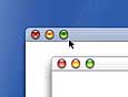
The new window top bar carries the "gumdrop" buttons for closing, resizing and hiding the window. A mouseover function only makes the symbol visible when rolling over the area. The symbols used are equal to the ones used in MS Windows: + for zooming, - for hiding, x for closing the window. Gumdrop buttons are color-coded in non-mouseover mode, this way the user learns which color stands for which functionality. The buttons appear in yellow, green and red. Their closeness to each other seems problematic. Apple have given up the better principle of separating the "dangerous" from the "benign" buttons in the window bar for a worse, more complicated model.
Dialog Box
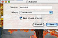
Pull-down menus have some transparency and fade out if they're not needed. Dialog boxes such as "Save As ..." are no longer modal and are attached to the relevant window. Like system menus, they have some transparency. Instead of simply appearing and disappearing, they are animated to scroll down out of and up into the window's title bar. The readability of messages can be restricted by the window's transparency.
Menu-bar
The Apple-icon has moved to the center of the menu bar; It represents the new "light source" for the desktop. It seems to originate in the top center, but some elements on the desktop, such as topmost windows, cast a shadow as though the light source were in its traditional, upper-left position. The centered position appears unusual and disturbing, as all menus have to be arranged around it. It's position restricts the consistency of left-aligning all Apple-Menus.
Finder
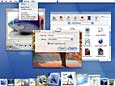
One of the most important features of the Mac GUI, the desktop-finder, has disappeared. Instead, all documents are represented in a filing system at the bottom of the screen called the "dock". The finder was a useful tool which provided a spatial orientation for the user, enabling navigation through any amount of files and folders. As a compensation it is now possible to navigate through lists of file-structures in the so-called finder-browser, another familiar tool for MS Windows users. Indeed the multi-windows mode could cause screen-clatter for the user, but it was always possible to find a way around this problem. Instead of improving this, Apple now decided to allow only one open window at a time. A very radical solution to the problem.
The Dock is always centered along the bottom of the screen and can accept any window or document. As the Dock grows full, individual "tiles" shrink. A user option called the "genie mode" magnifies tiles as the cursor moves over them. The Dock represents another equivalent to the Microsoft world: the task-bar. It displays a resized version of any open document, and also contains the trash-can. The finder-icon is always the first on the left side, the trash-can is always the last icon at the right end of the dock.
Very detailled Icons illustrate different document-types. The more documents have to be displayed in the dock, the smaller the icons shrink. The dock can display up to 128 documents at once, making recognition of a special document nearly impossible. There is no possibility to see document names in the dock.
The Dock holds as many things as you want to keep there. As you add items, the Dock expands until it reaches the edge of the screen. Once it reaches that point, the icons in the Dock shrink proportionately to accommodate additional items. To make the smaller icons more legible, however, we've included a great new feature called magnification: just pass your mouse over the icons, and they magnify to your preset maximum resolution. 8
Index
The new "look-again-look"